- ホームHome Home Home
- ロゴQについてLogoQ About LogoQ A propos de LogoQ
- ロゴQシリーズseries LogoQ series LogoQ series
- AQR システムAQR system AQR system Système AQR
- ご利用についてAdopt Adopt Adopt
- 知的財産情報Patent/Trademark Patent/Trademark Brevets/marques
- お問い合わせContact Contact Us Nous contacter
-

-
小SS
中MM
大LL
カラーユニバーサルデザイン(CUD)への取り組み
Color Universal Design (CUD) Initiatives
Initiatives en matière de conception universelle des couleurs (CUD)
より多くの人に伝わりやすく・わかりやすい、どのような色覚の人が見てもわかりやすい色覚バリアフリーカラーQRコード
Color barrier-free color QR codes that are easy to understand and communicate to more people, no matter what color vision they have.
Des codes couleur QR sans barrière qui sont faciles à comprendre et à communiquer à un plus grand nombre de personnes, quelle que soit leur vision des couleurs.
コンテンツ
オリンピックで益々来日する人が増え、情報面の抵抗を無くすことが必須です。
ユニバーサルカラーのロゴQは特に視認性に優れ、欲しい情報への入口としてあらゆる人々に優れた普遍性の高い情報の窓口です。
スマートフォンでQRコードのように撮影するだけで、欲しい情報にアクセスできます。 例えば旗のイラストであれば、その国の母国語での観光案内が出るイメージです。
こうした試みが情報面の抵抗・言語面の抵抗を軽減し、誰もが快適に日本で過ごせる第一歩になると信じています。
ユニバーサルデザイン研究室
(兼務:慶應義塾大学SFC研究所上席所員)
准教授 西山敏樹
CUD(カラーユニバーサルデザイン)とは?
What is CUD (Color Universal Design)?
Qu'est-ce que le CUD (Color Universal Design) ?
色の見え方や感じ方が、色覚正常といわれる人とは異なっている色覚異常の方は日本人男性では約5% 女性では約 0.2%の割合で、 日本人全体では約数百万人もいるといわれています。
色覚正常な場合には識別できても、色覚に障害がある人の場合は暖色同士や寒色同士の識別がしづらくなり、「赤と緑」「紫と青」「オレンジと黄緑」などが同じような色に見えてしまいます。
It is said that the number of people with color blindness who see and feel colors differently from those with normal color vision is about 5% of Japanese men and 0.2% of Japanese women, and there are several million people in Japan as a whole.
People with normal color vision may be able to distinguish between warm and cold colors, but people with color blindness have difficulty distinguishing between warm and cold colors, making "red and green," "purple and blue," and "orange and yellow-green" appear to be the same.
On dit que le nombre de personnes daltoniennes qui voient et ressentent les couleurs différemment de celles qui ont une vision normale des couleurs est d'environ 5% des hommes japonais et 0,2% des femmes japonaises, et il y a plusieurs millions de personnes dans l'ensemble du Japon.
Les personnes ayant une vision normale des couleurs peuvent être capables de distinguer les couleurs chaudes et froides, mais les personnes daltoniennes ont des difficultés à distinguer les couleurs chaudes et froides, ce qui fait que "rouge et vert", "violet et bleu", et "orange et jaune-vert" semblent être les mêmes.
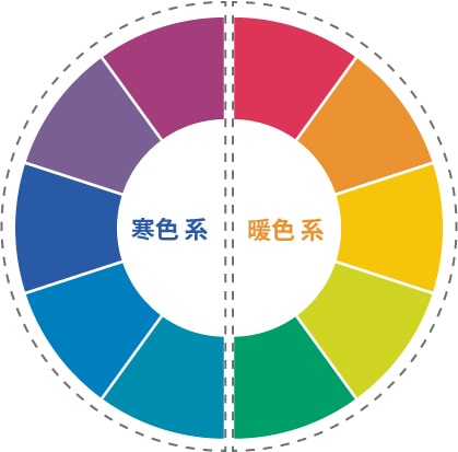
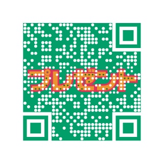
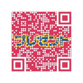
色覚正常な場合
When color vision is normal
Lorsque la vision des couleurs est normale
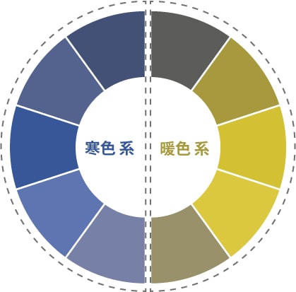
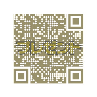
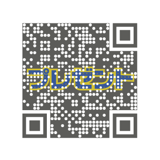
障害がある人の場合
In the case of people with disabilities
Dans le cas des personnes handicapées
こうした多様な色覚を持つさまざまな人に配慮し、多くの人に情報が伝達できるよう利用者側の視点に立ってつくられたデザインを、カラーユニバーサルデザイン(COLOR UNIVERSAL DESIGN)といいます。
Color Universal Design is a design that is designed from the user's point of view so that information can be conveyed to as many people as possible, taking into account such diverse color vision.
La conception universelle des couleurs est une conception qui est conçue du point de vue de l'utilisateur afin que l'information puisse être transmise au plus grand nombre de personnes possible, en tenant compte d'une vision des couleurs aussi diverse.
フルカラーコードとしてCUDへの対応
Support for CUD as a full-color code
Soutien à la CUD en tant que code couleur
フルカラーのコードを作れる世界で唯一の企業として、当社の開発したロゴQコードをCUD(カラーユニバーサルデザイン)に対応することを研究課題として取り組んでいます。
As the only company in the world capable of producing full-color codes, we are working on a research agenda to make our logo Q code compatible with CUD (Color Universal Design), which we have developed.
En tant que seule entreprise au monde capable de produire des codes couleur, nous travaillons sur un programme de recherche visant à rendre notre logo Q code compatible avec le CUD (Color Universal Design), que nous avons développé.
明度の似た寒色同士・暖色同士の組み合わせ
Combination of cold and warm colors with similar brightness
Combinaison de couleurs froides et chaudes avec une luminosité similaire
色覚正常な場合
When color vision is normal
Lorsque la vision des couleurs est normale
障害がある人の場合
In the case of people with disabilities
Dans le cas des personnes handicapées
寒色同士と暖色を組み合わせて作成
Create a combination of cold and warm colors
Créer une combinaison de couleurs froides et chaudes
色覚正常な場合
When color vision is normal
Lorsque la vision des couleurs est normale
障害がある人の場合
In the case of people with disabilities
Dans le cas des personnes handicapées
ロゴQはどのような色覚の人が見てもわかりやすいカラーQRコードとして、色をどのように調整すれは識別しやすくなるかを考え「色覚バリアフリーQRコード」を目指し製作しています。
LogoQ is a color QR code that can be easily understood by people with any kind of color vision, and is produced with the aim of becoming a "color barrier-free QR code" by considering how to adjust the color to make it easier to identify.
LogoQ est un code QR de couleur qui peut être facilement compris par les personnes ayant toute sorte de vision des couleurs. Il est produit dans le but de devenir un "code QR sans barrière de couleur" en considérant comment ajuster la couleur pour la rendre plus facile à identifier.
